welcome To Bea Inspired - the Journal

Are you struggling with designing a wedding day that feels cohesive, reflective of your personality, and fresh while also having that extra special something? Not sure how to add that extra something special? Maybe you’ve gathered inspiration images, have a variety of pinterest boards ready to go, assembled the usual wedding magazines and planning books into a neat pile on your desk, and are ready to start honing in your wedding day design. You’ve identified your color palette, and for the most part can envision your wedding to aesthetic. You’ve met with a handful of your vendors and started the planning process with each but things still feel disjointed. How in the world are you going to tie together all of these ideas?

Well friends, today I am here to tell you about something I like to call the crescendo effect. Often a term used in musical settings, crescendo refers to something that increases gradually in intensity over time. This concept describes perfectly how to build a truly unforgettable wedding day experience – one that naturally increases in complexity with each element of the wedding day. The crescendo effect is the glue that holds your overall design together and seamlessly allows for each touch point to naturally flow. I’m a firm believer that you can use the crescendo concept to craft the most intentional, thoughtful, and beautifully designed wedding experience. Today I am going to provide with four concrete examples of how the crescendo effect can help you create cohesion for your wedding design- ensuring that it is equally breathtaking as it is purposeful.

So what does it mean for your wedding experience gradually build in intensity over time? Let’s start with your guests first touchpoint – your save the date! Your Save the Date gives your guest not only a glimpse into your personality and who you are as a couple but also is the perfect opportunity to drop a few hints at what to expect from your upcoming wedding. This is the perfect opportunity to introduce elements of your color palette or soft thematic components that will be carried through – like a favorite floral for example. This first touch point should be a teaser – only giving a small glimpse at what is to come.
Another introductory space to infuse a gradual build in excitement is through your website. Here is where you start to set the tone for what guests can expect in regards to formality of your event by highlighting dress codes (if any) and introducing venue specific details. Most wedding websites include sections for you to start to introduce your story – I would encourage you to think strategically about the details you incorporate here. I love to work with my full service clients to identify those fun details that will help make their wedding day uniquely theirs. Introducing some of these heartfelt details on the website will allow your truly observant guests to identify their meaning during your wedding.

Your invitation suite is the next touch point you will provide to your guests. A coordinated suite is the perfect opportunity to provide guests with a deeper glimpse into what can be expected from your wedding day. To bring in the crescendo effect here – consider building upon the what has already been shared in your save the date and on your website. This can include adding additional floral elements that may be seen in your floral arrangements through a delicate water color envelope liner; introduce additional colors from your color palatte or consider letterpress or rose gold foil to add texture, luxury or a hint at a metal guests might expect. Your calligraphy could also showcase the artist you will be working with for signage for the event – thereby tying in all the lettering together to create a truly cohesive look.
The welcome gifts at the hotel are that perfect first introduction to the wedding weekend. They are the perfect element to help your guests feel loved – including items that showcase who you are, where your from, and of course the after party essentials! If you are incorporating watercolor into your stationary, perhaps you decide to include a custom designed map to highlight where all the events will be taking place (bonus if you include things to do in the area!). The welcome gift has the ability to truly set the stage for what is to come in the days to follow so be sure to include a discussion with your planner on how to tie this seamlessly into your overall wedding design.
Want to learn more about you to use the crescendo approach to create a wedding day that builds naturally? Be sure to join the YSDE newsletter this week. Next week’s newsletter (8am on 6/12) will include 4 additional tips on how to use this approach and you won’t want to miss these exclusive insider planning tips!
As an event designer, I work with my couples through an extensive design development process to identify these intricate features that really make their wedding experience – for both themselves and their guests – truly extraordinary. Utilizing this concept of a crescendo allows for us to ensure the event cohesively builds excitement as each beautiful element is released to guests. This approach requires fore-thought, patience, and editing but it is one that promises to create that one of kind event. Looking for assistance with crafting your own beautiful event that has its own crescendo effect? Drop me a line – dreaming up beautiful heartfelt designs is one of the many things I love about this role!

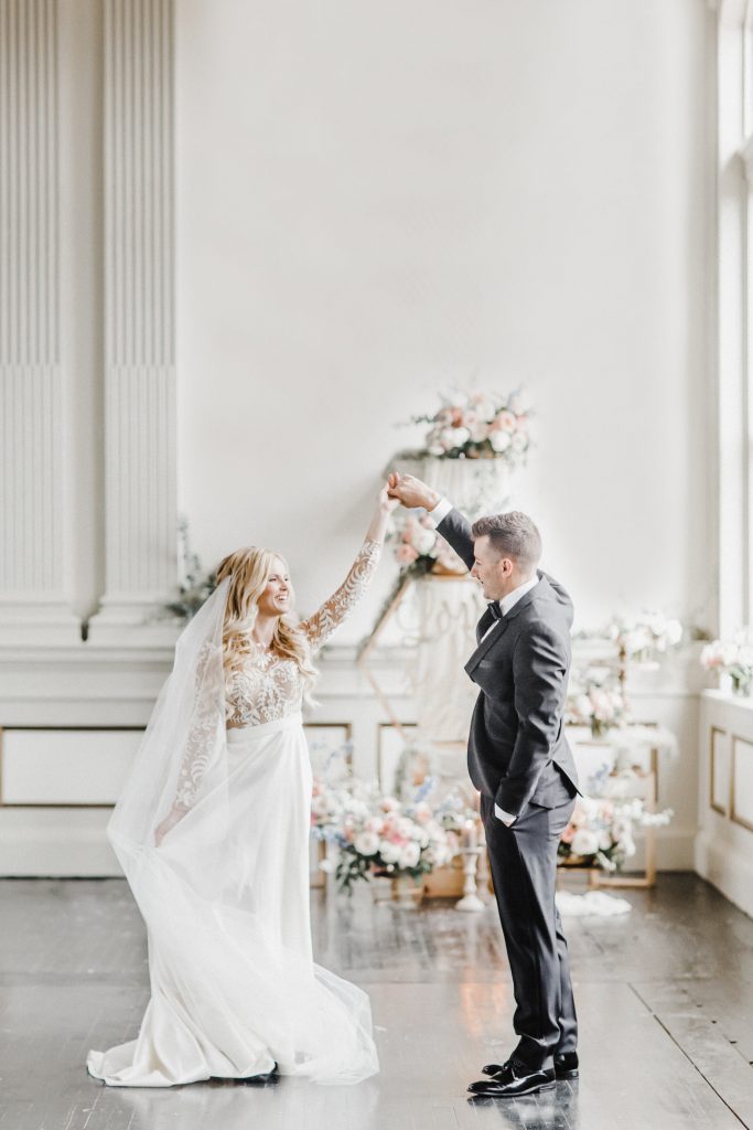
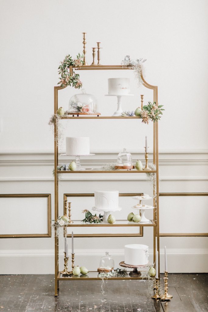
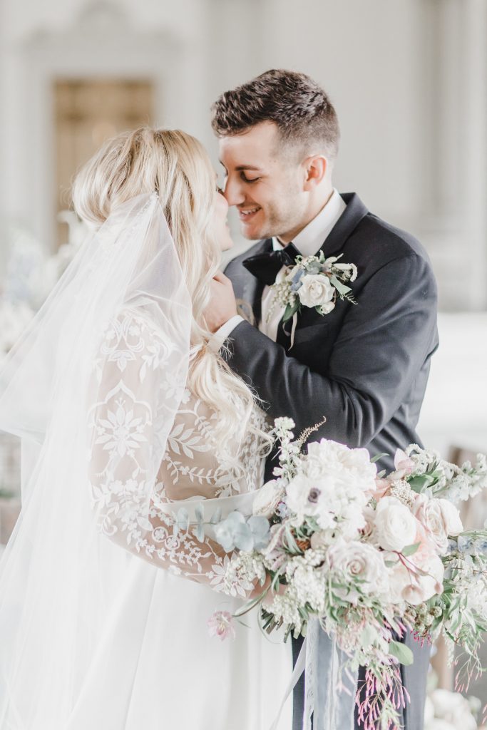
The images within this post are from the Spring Caroline Logan Photography Workshop Editorial. The fabulous vendor team is listed below:
Photography & Workshop | @carolineloganphoto
Planning | @yoursweetestdayevents
Florist | @wildflowersbydesign
Venue | @ecklindevelopment
H&MU | @unfadingbeautybykristen
Furniture | @treasured.events
Dress | @bhldn
Tux | @theblacktux
Cakes | @bakerstable
Cookies | @k_sweetdesigns
Stationary | @prairielettershop
Custom Signage | @theconfettihome
Custom Calligraphy | @bowandarrowcalligraphy
Balloons & Napkins | @corkcollection
Vintage Stamps | @verdestudio
Candles | @creative.candles
Glass & Dishware | @gigiandlaclede
Linens | @tonoandco
Banner | @linenandpoppi


[…] chatted a little about the cresendo effect – a design tool we use. Briefly, this design approach seeks to take your guests through your […]